When it comes to building a business, you’ll hear a lot of terms – “differentiators” and “KPIs” and “brand recognition,” oh my! But there’s one term that doesn’t quite get the attention it deserves, and it’s the granddaddy of them all – and that’s corporate design.
When we say “corporate design,” we mean more than traditional graphic design; it’s a catch-all term that encompasses both the strategy (like your branding) and the design (like your brand identity) of your corporate identity. It’s about the assets you create (your logo, for example) and the reasoning behind why you design them a certain way. It’s both who you are to your customers and how you want to convey your message. So needless to say, it’s a pretty big deal.
But how exactly does one approach a corporate design? What are the main components? And how do you create a corporate design that puts you a solid step above your competition and turns your ideal customers into lifelong brand ambassadors for your company?
Definition
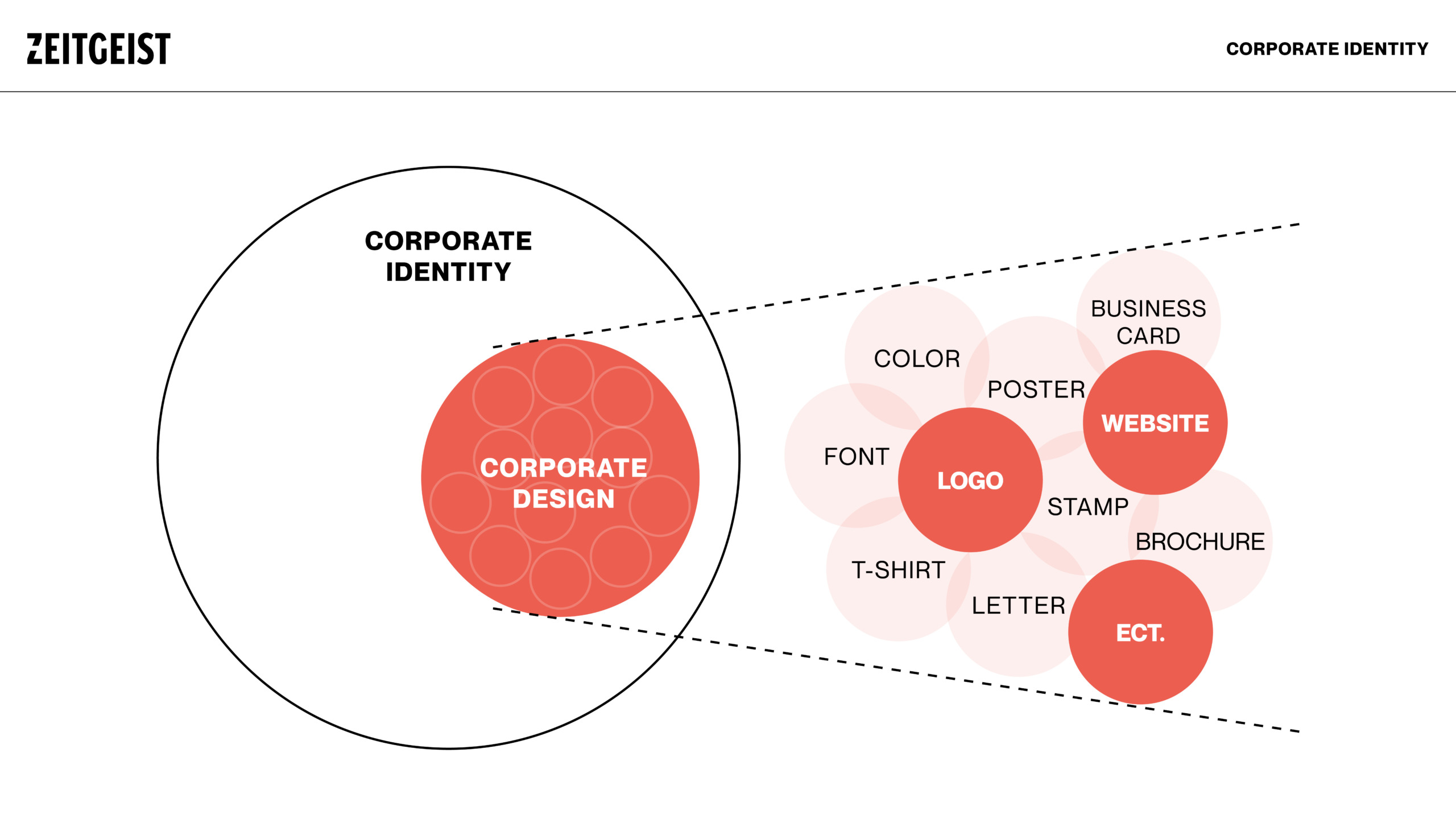
An essential component of a successful corporate identity strategy is corporate design (CD). Corporate design is the sum of all visual information and communications of a company or organization.
Structure
A logo and color palette alone do not make a brand identity. When designing your identity, you need to create a comprehensive visual language that can be applied to everything from your website to your packaging. Depending on your brand (and the type of content you plan to create), your requirements may be more extensive but include a basic brand identity:
- Logo
- Colors
- Typography
- Design system
- Photography
- Illustration
- Iconography
- Data visualization
- Interactive elements
- Video and movement
- Web design
The most important elements are described in detail below.
1. logo
Typically, a logo is designed for instant recognition. Users often identify a company by its logo. Just look at the pictures above: The names of the companies should immediately come to your mind… But a logo is only one aspect of a company’s brand strategy. It helps differentiate a company from its competitors, of course, but a great logo means nothing until the brand makes it mean something. If you are tasked with designing a logo for an organization, you should create an abstract image that is clean and simple with little meaning until the organization’s brand adds that meaning. You can read more about the importance of logo design in Seth Godin’s article.
2. typography
A well-proportioned, clean font can make all the difference on a website or even a company flyer. Good typography creates that “there’s something to it” feeling in people’s minds.
One of the most successful fonts that can be seen everywhere (signs, buildings, airplanes, etc.) is Helvetica. It is the King Kong of scriptures, and it is more than 50 years old. Helvetica changed the world of typography. It showed typographers and graphic designers that simple is good.
Large companies tend to use clear sans serif fonts. A font should reflect the image and beliefs of the company. If a company is more conservative, it should use serif fonts, such as Times New Roman: these fonts reflect classic designs. With the help of a great typography, a company should highlight the motto or the message that is being conveyed to the users.
All website text, not just corporate websites, should be easy to read. A web designer should take into account the different browser rendering engines; text fonts are not rendered the same in all browsers.
For large corporate websites, usability is playing an increasingly important role in typography design. A company should also be considerate of its users with disabilities who can only read with the help of a screen reader, etc. It is not always a good approach to embed text in images and not use -tags because screen readers cannot read the text. Unfortunately, the majority of large organizations are still struggling with this problem.
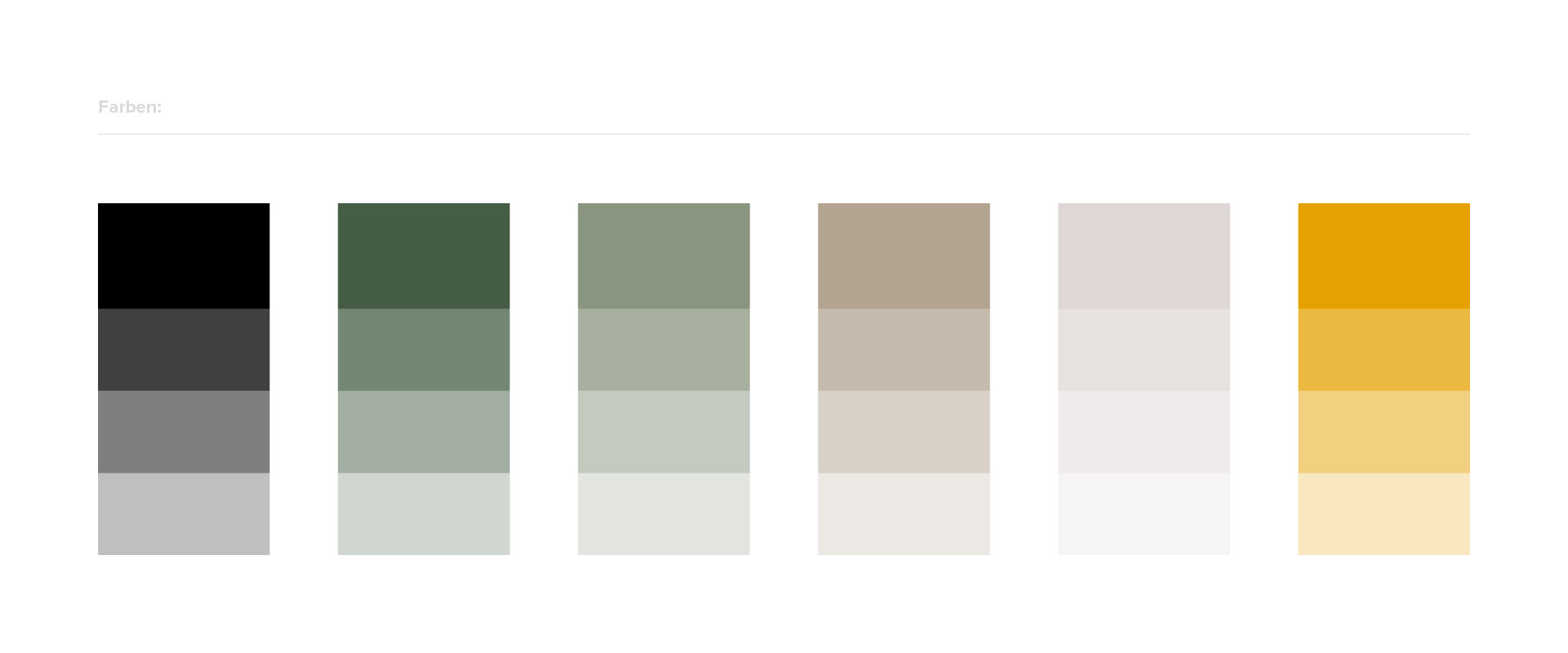
3. colors
A graphic designer should usually be careful when designing the visual identity of a large company. Different color combinations, color meanings and color theory should be considered.
The corporate color scheme the designer chooses makes a strong statement about the company and the way it does business. As with all the other seven elements, the colors should also emphasize the company’s philosophy and strategy.
Research by the Institute of Color Research has shown that all people make a subconscious judgment about a person, environment or object within 90 seconds and that this judgment is based on color alone. This illustrates the important role of colors in corporate graphic design.
Enter the world of color harmony and color palettes. There are many useful online tools for creating beautiful, appealing colors, such as COLOURlovers, which showcases color trends and palettes.
Development
Several steps are necessary to develop a professional corporate design. At the beginning away, you should deal with the requirements of the final result. In other words, what really distinguishes a good corporate design?
Basically, however, the development process of a corporate design is divided into two parts:
- (Brand) Strategy
- Design
So before you get down to implementation you need to define a strategy. It’s like the blueprint of a house. This must be created before one can go to the implementation, i.e. the selection and application of the materials.
Requirements
A strong brand identity needs to work for everyone, both your internal team (e.g. brand ambassadors, content creators) and the people who interact with it (e.g. customers). When you begin the design process, make sure your brand identity:
- Distinctive: It stands out from the competition and attracts people’s attention.
- Memorable: it makes a visual impression. (Take Apple: the logo is so memorable that they only use the logo – and not their name – on their products).
- Scalable and flexible: It can grow and develop with the brand.
Cohesive: Each part complements the brand identity. - Easy to use: It’s intuitive and clear for designers to use.
If any of these elements are missing, it will be a challenge for your brand team to do their job well.
Part 1 – Brand Strategy
Brand strategy is the basis of a successful brand. All other expressions such as character, language, communication and corporate design (visual expressions) build on the brand strategies. The brand strategy, in turn, can be defined in two sections.
Internal Brand
The internal brand is the internal alignment of the brand. It defines the brand in its basic features. Specifically, these 4 points should be answered in the process:
- Vision – Where do we see the brand in 5 years?
- Mission – What do we do every day to get there?
- Values – What values do we represent along the way?
- Purpose – Why did we create the brand?
Positioning
After clarifying the internal aspects, it is important to look outward. Here we are talking about positioning, i.e. the position that the brand occupies in the market. Specifically, it is the relationship between competitors, target groups (and their segments) and the company’s own brand and how this is perceived in the customer’s mind.
- Target group (and their segments) – Who are we addressing?
- Competitor – Who are we competing with?
- Own USPs / Differentiators – What sets us apart from others?
Part 2 – Design
Below is an overview of the ways you can develop and implement a design, based on the previously defined strategy.
DIY
If you already have a lot of design experience and a good eye for design, you can go the DIY route and create your design assets yourself. Remember, this is only recommended if you have a strong design background (design is not easy, folks!).
In-house design team
If you have a lot of design work, you can hire an in-house designer or design team to develop your brand design from scratch. While this works in some business models, it can definitely be a challenge – if you don’t have a specific project you want your team to work on, you’ll be paying them to twiddle their thumbs. That’s why many companies are opting for the next two options….
A line art design for a coffee roaster by chandra.k.
Freelancer
Hiring a freelance designer can be a great way to get the design work you need without having to hire someone permanently. It’s more affordable and flexible, and when your project is finished, you don’t have to worry about overhead.
However, hiring an independent freelancer only works if you know exactly what you want and can explain that vision to your designer; otherwise, you’ll waste a lot of time going back and forth trying to find a concept and design that suits you. If you are not sure what you want, we recommend you to choose the last option…
Competition
A brand identity contest is the perfect option for companies that aren’t sure how they envision their brand design coming to life. In a brand identity contest, you issue a design brief and top designers from around the world put together their ideas, concepts and designs for your brand. You check the patterns, choose the best and pay only for the design you have selected. It’s simple, it’s easy, and it’s the best way to get lots of ideas without having to pay for large chunks of individual designers’ time.
Agency
If you are looking for an all-inclusive package, consider a design agency. Design agencies usually have excellent designers and can handle everything from ideation to strategy to actual design – but this kind of service will definitely cost you. Design agencies are high quality, but also extremely expensive. So if you have a limited budget, you should definitely consider it.
Manual
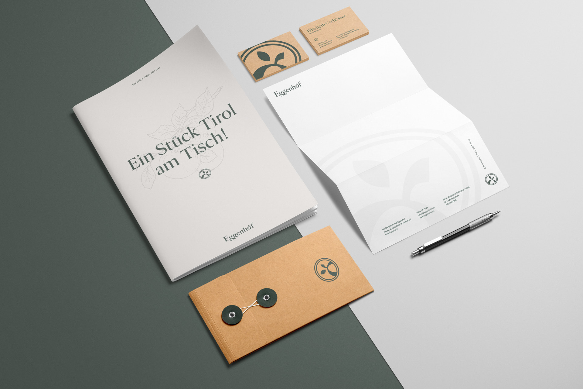
The purpose of a corporate design manual is to provide detailed guidelines for each element of your brand’s visual identity. Often this resource is referred to as a brand book, brand identity manual, or brand style manual. It is usually a PDF file or web page that contains instructions for or links to all of the brand identity design information and resources discussed above. All your visual resources are stored in or linked to your brand style guide.
Here is an example of brand identity design (called corporate identity) for FedEx, a brand we will use as an example below. However, each brand’s style guide will be different. For example, a winemaker should have detailed information about label sizes, logo placement and so on. A restaurateur may have specifics on menu layout, fonts for main dishes, fonts for dish descriptions, and others.
Here are some of the elements you should include in your brand style guide:
- Business Cards: Business cards are one of the easiest ways to spread your brand identity. At the very least, your business cards should include your brand colors and logo.
- Stationery and envelopes: The standard brand identity design should include a letterhead, which usually includes your logo and often the brand colors.
- Website: One of the most important ways a brand’s identity is portrayed is through its website colors. When you update your brand identity, your website probably needs to be updated as well.
- Packaging: If you sell physical goods, you need a way to package them. Whether it’s a coffee bag, a muffin box or a napkin, your custom packaging should reflect your brand’s visual identity.
- Uniforms: What your team members wear can also convey the brand identity design. If clothing is part of your operation, your brand identity design will dictate how that clothing looks.
Every resource your organization uses should be described in this style guide. Think of it as a repository for all things visual. If you add additional designs, for example a new shopping bag design, you will add to the style guide. The style guide is where all the design details reside, so you can maintain the cohesion that is so important to brand identity design.
Summary
Corporate design describes the totality of all visual expressions of a brand and is part of an overall corporate identity. Accordingly, it is also important to base the corporate design on the corporate/brand strategy in order to present a consistent and uniform image to the outside world.
The corporate design should be unique, easy to apply and memorable. It should also provide the necessary flexibility to allow for further developments and adaptations in the future.
The development is accordingly composed of brand strategy and design. Usually it is a process which lasts for months, especially when it comes to further expressions such as website, banners, car wraps, clothing etc.