Creating a style guide is often a tedious, decision-intensive task. Most large companies invest a lot of time and money to ensure that the guide fully covers their brand, their corporate culture and all their design and marketing needs.
But what about the small businesses, the start-ups and the struggling entrepreneurs? Well, here’s a quick guide to a simple yet functional style guide.
Audience, audience, audience. If you don’t read anything else, please remember that you should always consider your audience when doing anything related to design.
Create guide
Want to create a great style guide? Here is the ultimate guide you need, attachment from the car brand Audi as an example.
1. embed logo(s)
The logo is the primary visual identity of the brand and as such, it deserves the first place in our process.
Make sure to include all variations of the logo (e.g. light / dark / transparent backgrounds, custom emblems, mobile vs. desktop, etc.).
This is also a good time to explain the details of how the logo will be used
- What spacing should there be around the logo?
- What kind of backgrounds are appropriate?
- When do you use the emblem and when the full logo?
If you want to be very specific, you can also specify all the “do’s” and “don’ts” for using the logo
2. create a color palette
Colors arouse emotions and influence memory. The color palette is the core of any brand and should reflect the overall tone you want to communicate.
Do you want a vibrant and energetic brand? Choose a high saturation and brightness. Do you want a more “professional” brand? Choose more muted, traditional colors. However, use accents to add helpful splashes of color that are especially useful for powerful call-to-actions.
Tools like the one shown above (DesignGapp) and Adobe’s Color can display complementary / composite / analogous colors to find good matches for your primary color.
Pro tip: Make sure your colors are accessible when used in text on the web. There are tools you can use to check if they meet the minimum thresholds.
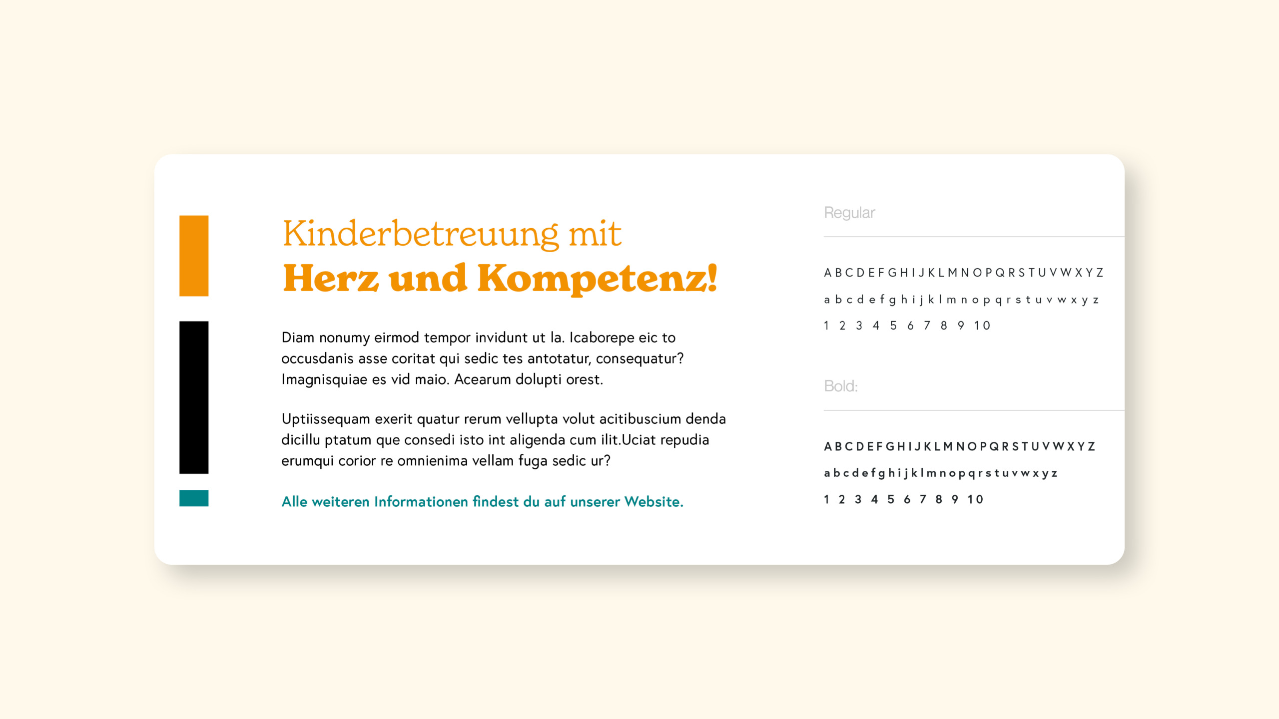
3. select the font(s)
If you ever want to spark a design debate, bring in fonts. The font(s) you choose, just like your color palette, will convey your brand’s style.
I’ll be honest, I haven’t made it through all the Helvetica documentation, but I know enough about fonts to know how important they are to a design. If you’re a hip tech startup, you probably don’t want to start with Comic Sans. If you are a fun toy company, Arial would be a boring choice. Do not use papyrus under any circumstances.
There’s a lot to consider with font (weight / style / size), but these decisions help establish the textual tone of your content. Also consider your medium – if you’re focusing on print, serif fonts tend to be more legible than for a web engagement, where sans-serif fonts render better (though this is subject to debate and technology updates).
Pro Tip: Try not to use more than two fonts in a design, as this can be visually distracting.
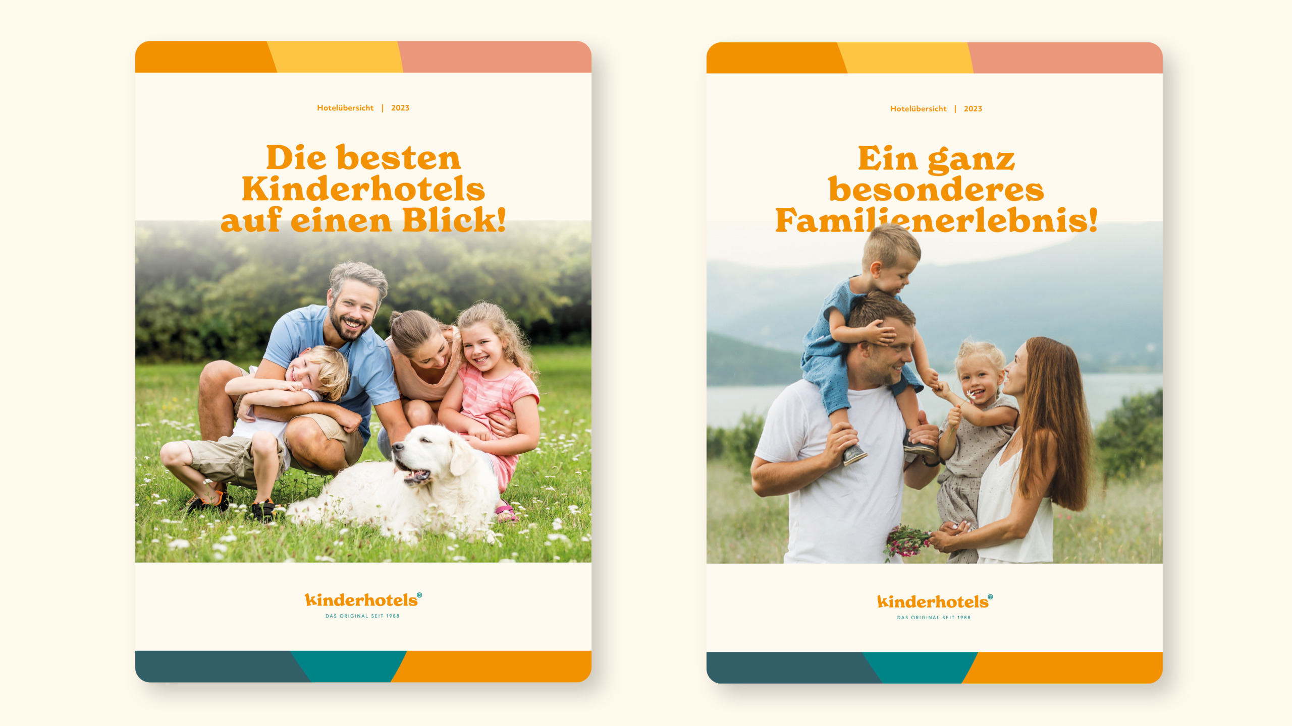
4. include visuals
Choose images that enhance the overall aesthetic of the brand. These images serve to set the tone of the visual language.
Photographs, illustrations and graphics can humanize your brand and say a lot about the brand perception you want to establish. Whether it’s a photo of someone using your product, a powerful background graphic, or a custom illustration, they all help communicate your brand effectively to your audience.
Personally, I have always relied heavily on photography in my designs. It adds a great deal of visual interest and can communicate so much on its own (it’s especially effective when accompanied by simple text and a call-to-action).
Pro tip: One of my favorite tools for great royalty-free stock images is Unsplash – they have a huge library and great developer support.
Often one speaks here also of the so-called
Keyvisual
. These are visual representations that describe the brand very well with a picture. Often, as seen above with Audi, these are used as advertising banners.
5. add iconography
Using iconography is a great way to create quick connections and promote understanding of your content.
If your text and content can be accompanied by icons, you will usually be more successful in conveying meaning efficiently. Most people are visually oriented, and icons are easy to scan and very useful (especially in web products / apps).
Your style guide should have all versions of your icons ready for your design, development and marketing teams to use in their deliverables.
Pro tip: Try to use icons from a single library to ensure the overall design style is consistent. I rely heavily on IcoMoon for web-based projects.
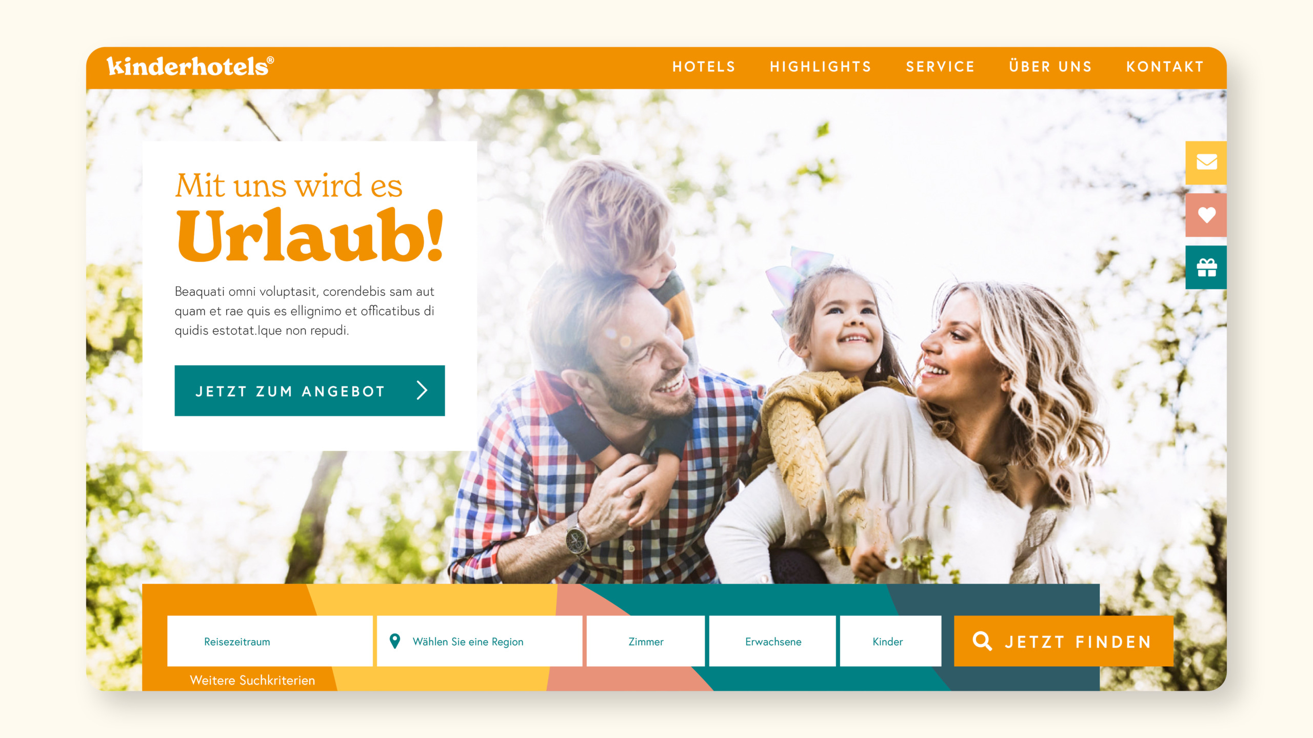
6. set up UI elements
If you have web or app-based solutions, make sure you clearly communicate how the UI elements will be used.
Whether it’s how and when to use header sizes or different button styles, your style guide should be very clear about the design of UI elements and how they should be implemented. There are many different UI elements, so include all that apply to your context, but be thorough and make sure your development teams have input and access.
Pro tip: Whenever possible, provide specific details on how to implement these elements. Add CSS or necessary javascript to make your team’s work easier.
Examples
The image examples above show very well how the Style Guide from Audi is structured. Below are more examples of excerpts from various style guides from major companies.
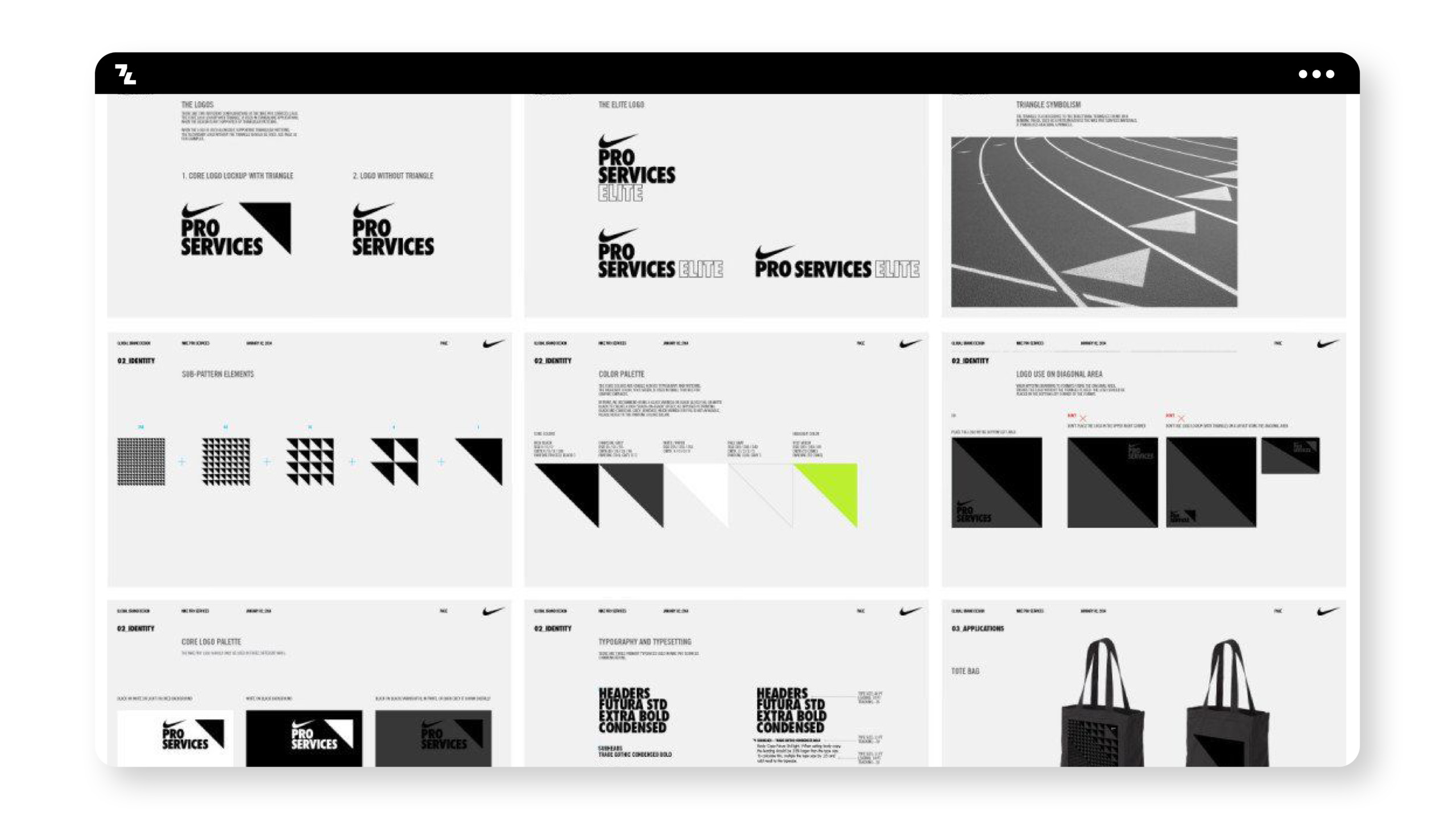
Nike
Nike, as one of the most famous sports and hero brands, relies heavily on the image logo, as well as other geometric shapes, as well as patterns from it and rather holds back in terms of color. The
branding
is known worldwide and has a clear recognition value.
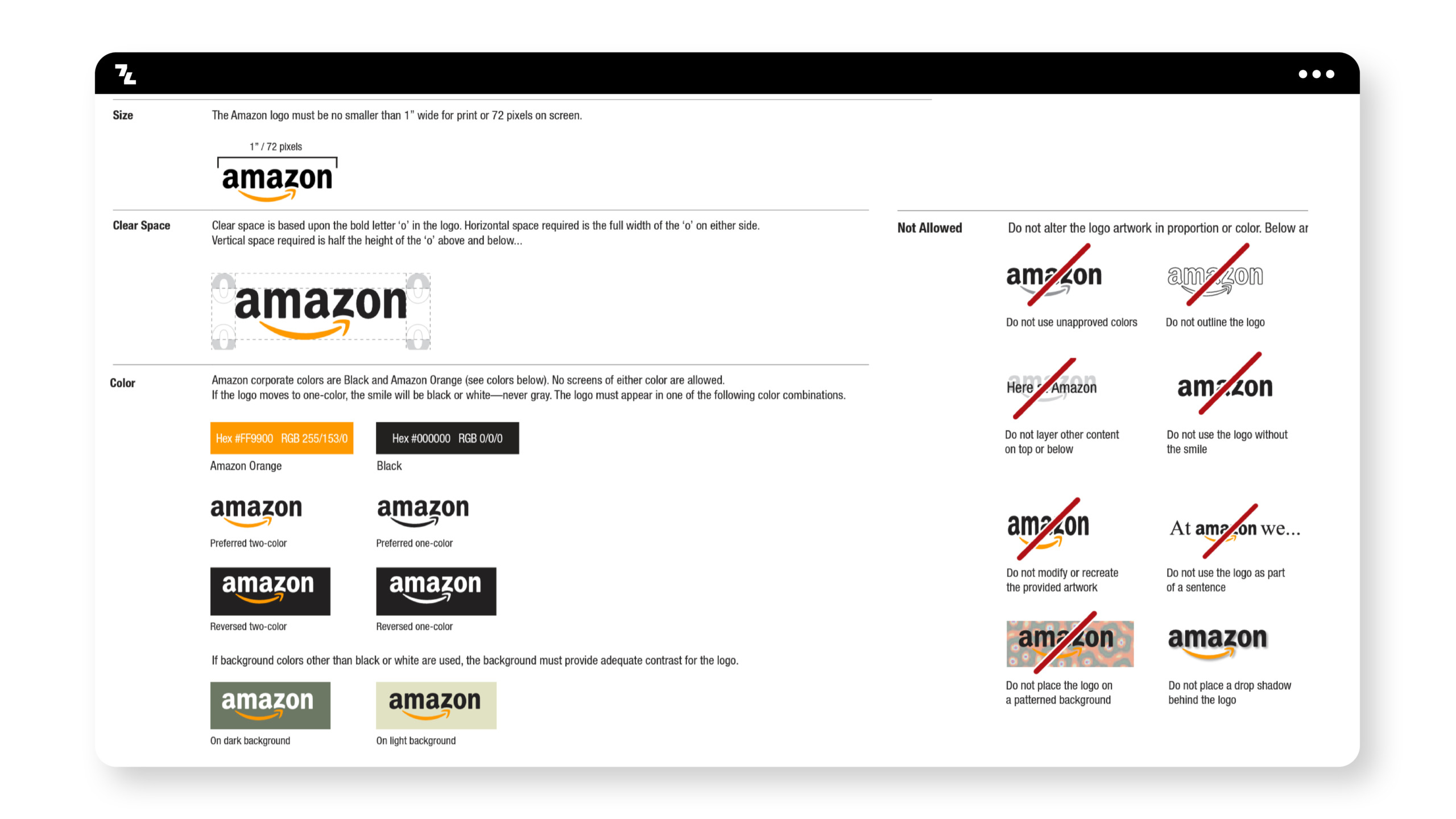
Amazon
The visual guide to the Amazon Brand relies quite heavily on consistency in terms of the primary logo shape. Here it is clearly described that the image and type logo belong together and there must be no abstractions or variations of them. Presumably to provide security to the worldwide customer base in all age groups.
Volkswagen
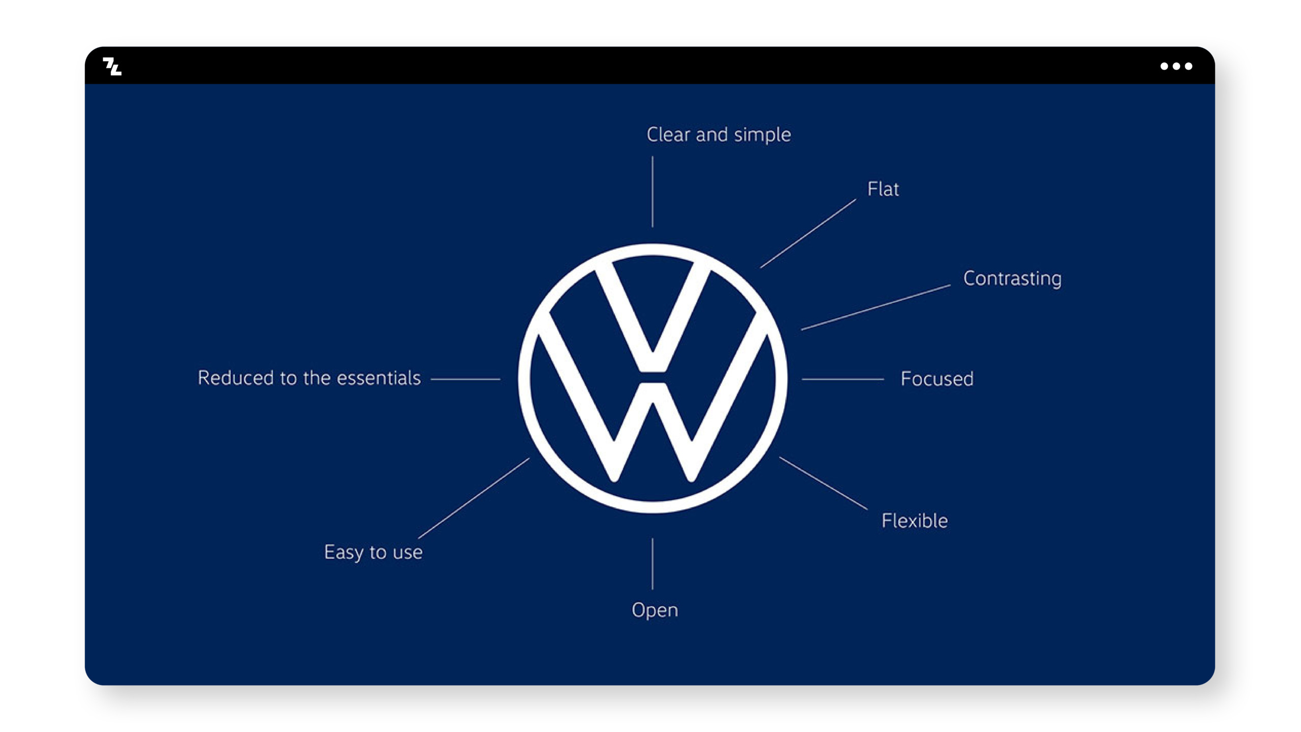
Volkswagen is from
Brand Archetype
view itself clear Everyman Brand. The style guide of this brand is characterized by modern rebranding with a focus on e-mobility and digital first through simplicity and clarity.
*Note. Unfortunately, we currently only have the logo. We will update the article as soon as more is available from VW.
