
Project information
Kinderhotels, the original since 1988, is the first hotel group, which from the beginning was designed specifically for vacations for families with children. The company can look back on over 30 successful years and an excellent reputation.
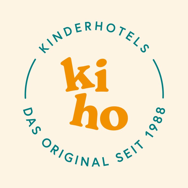
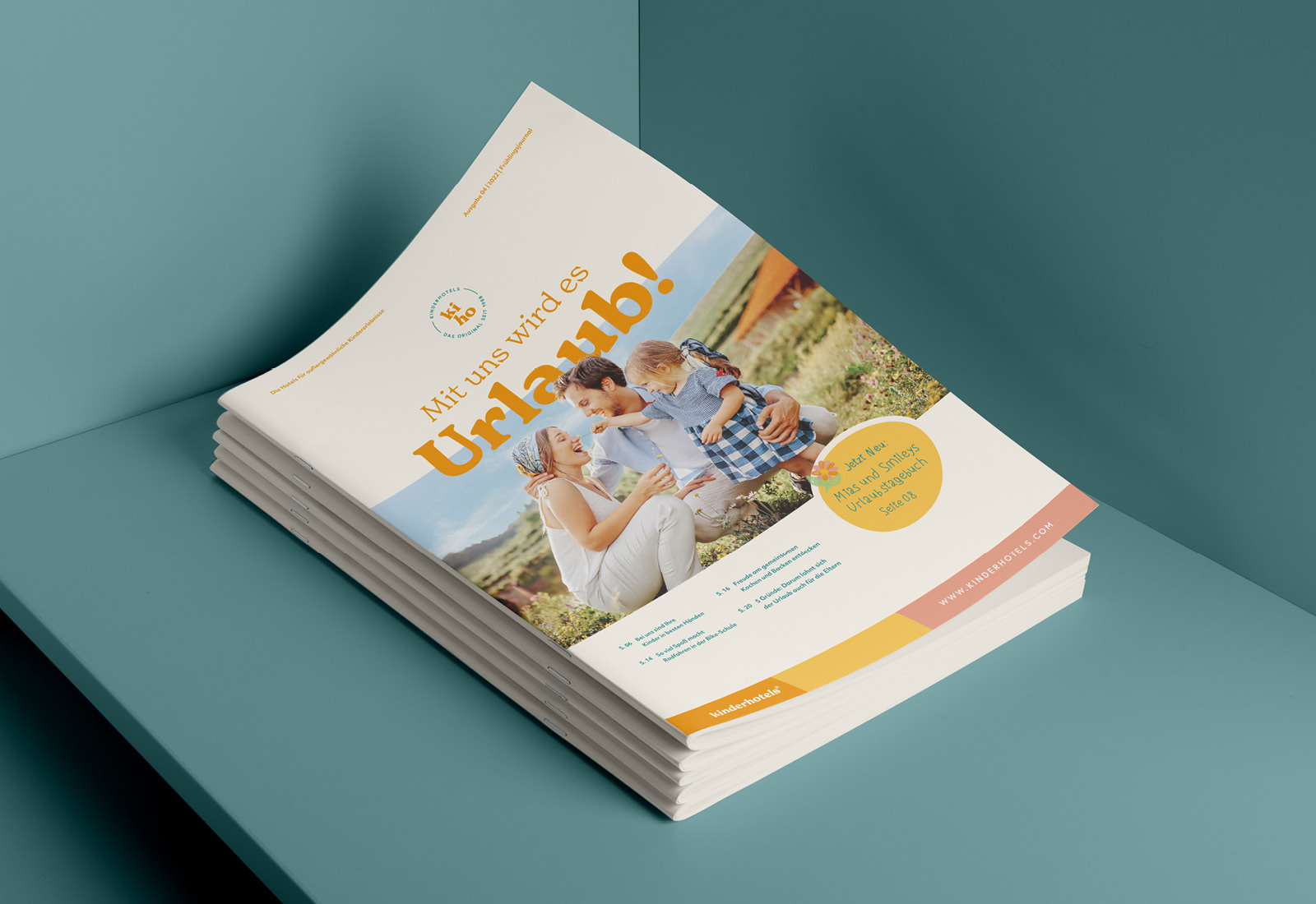
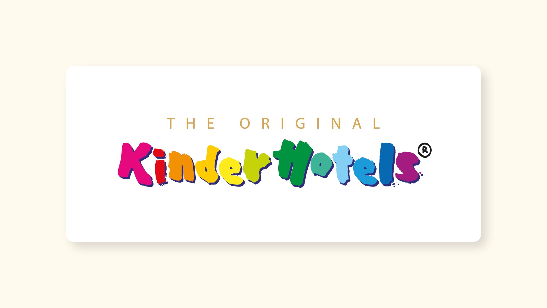
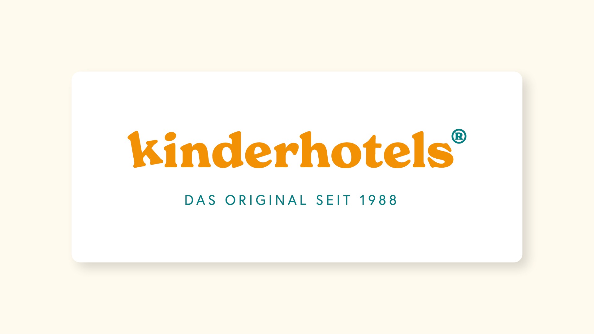
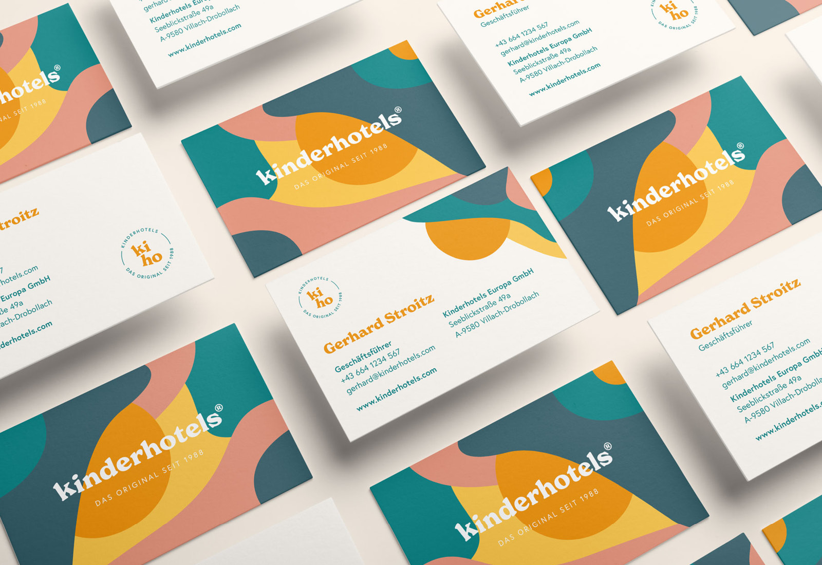
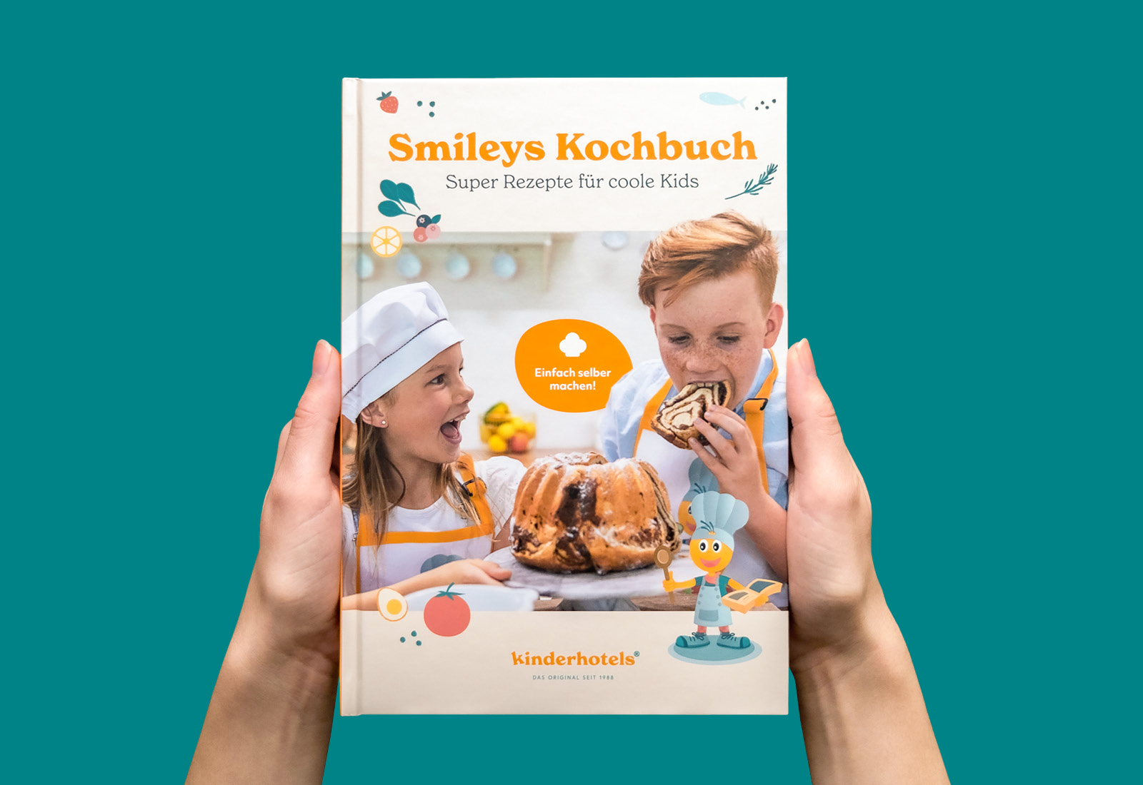
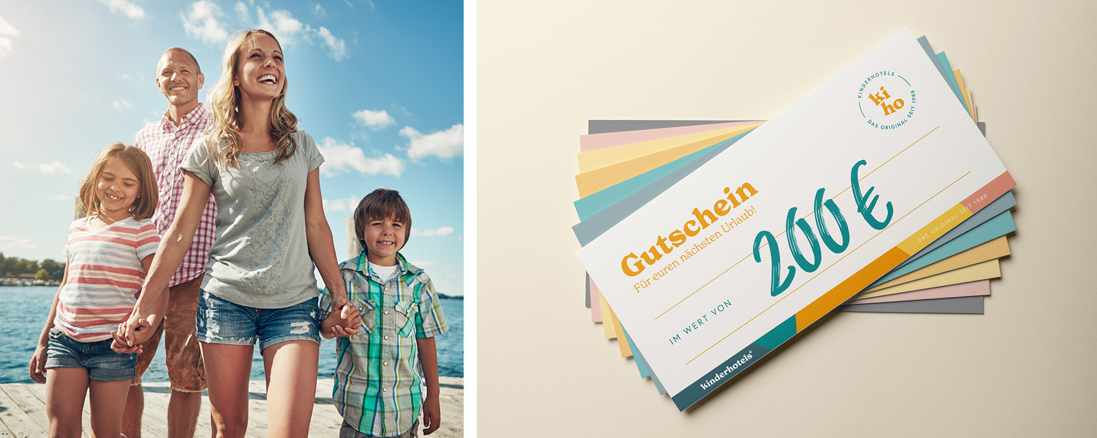
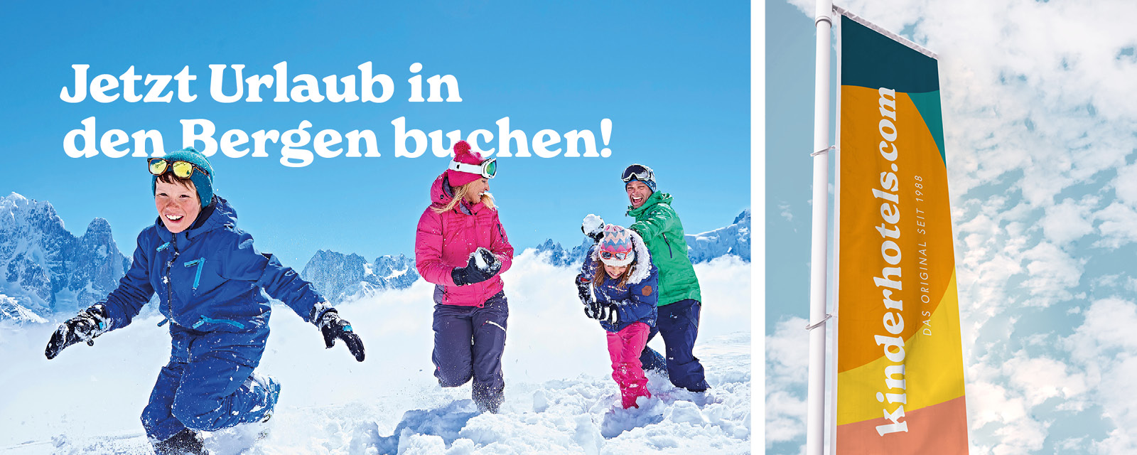
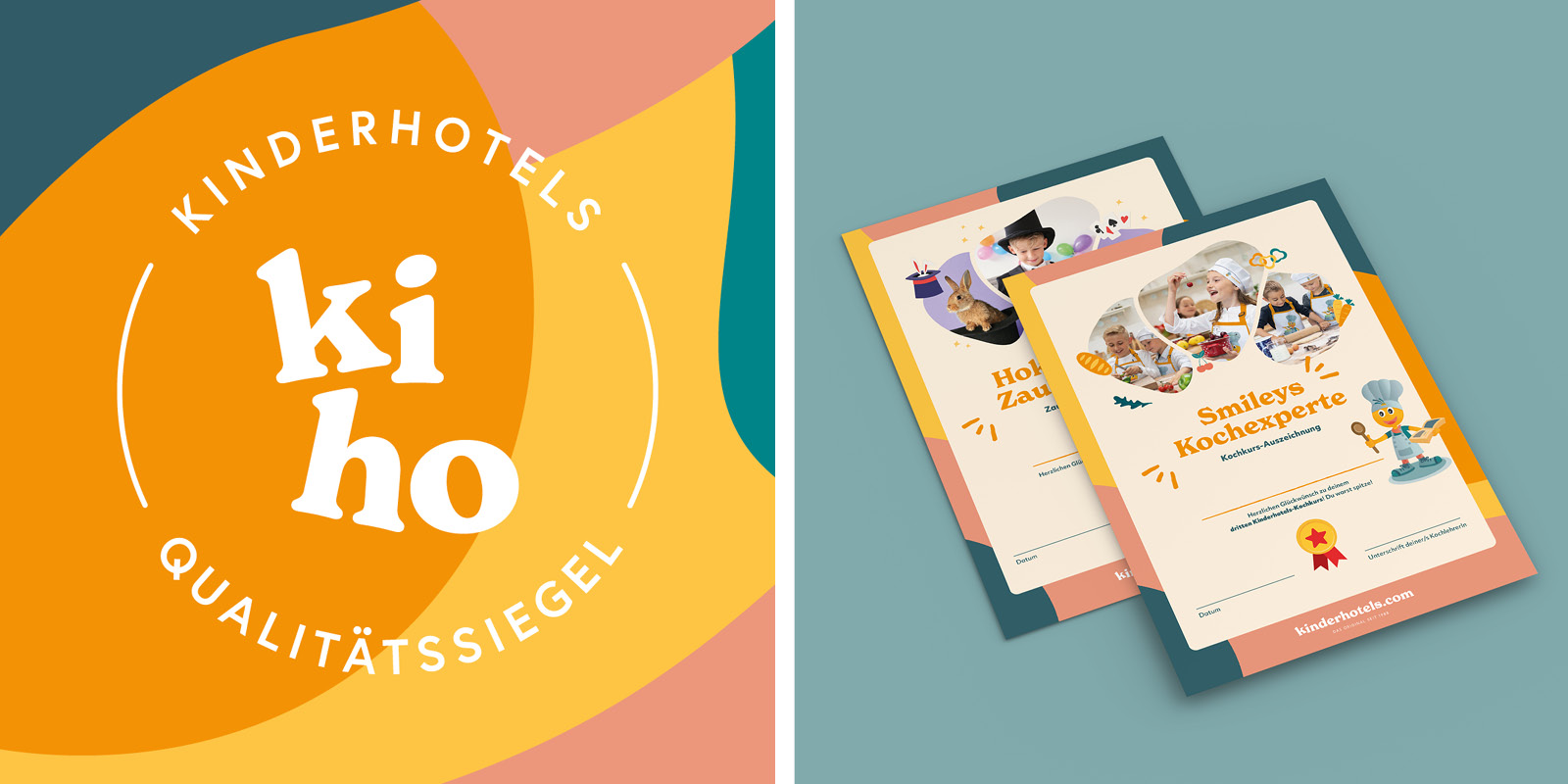
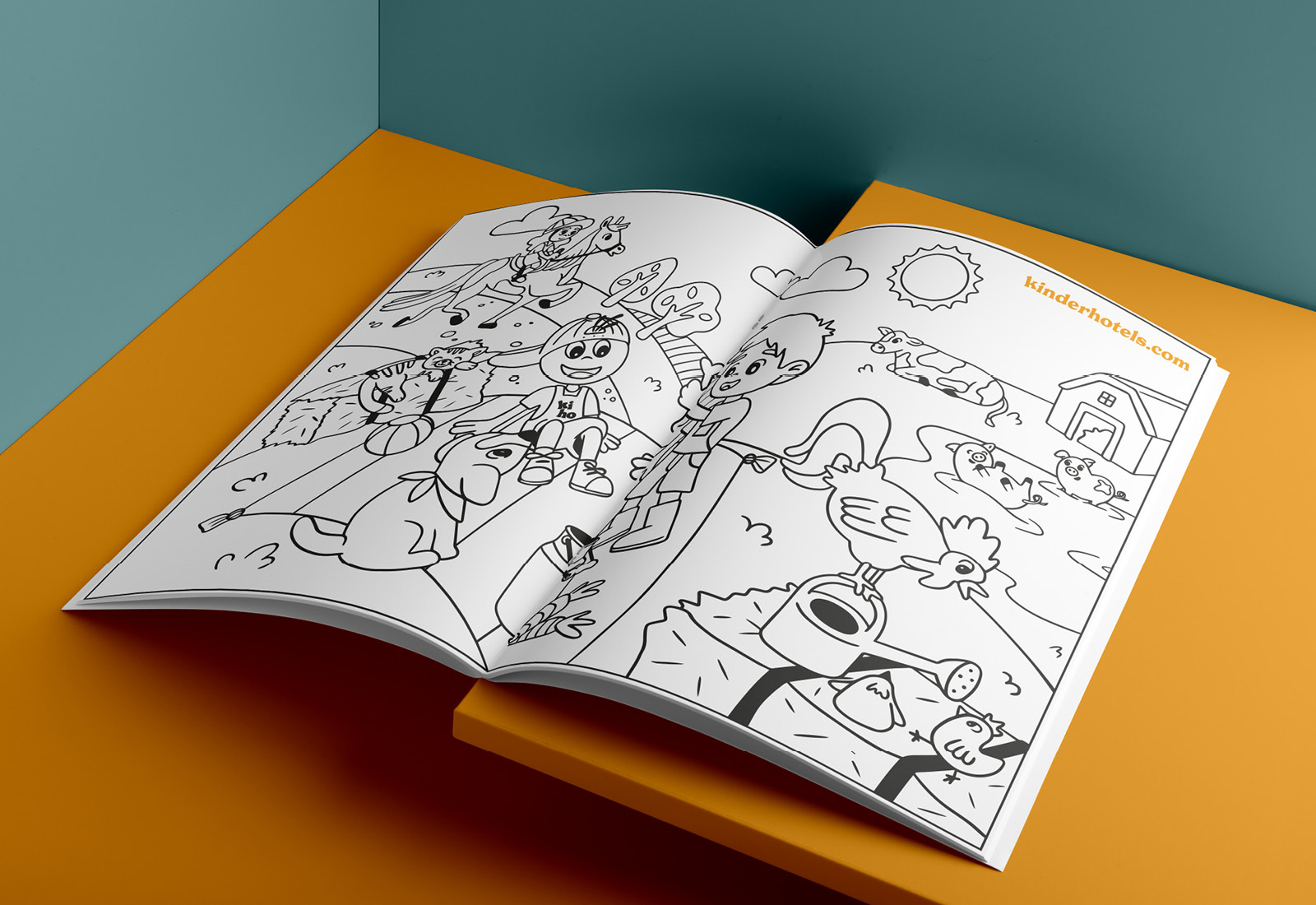
At some point, it was time for a contemporary overhaul of the branding. This was achieved through a realignment of the entire corporate design, including print media, and the Kinderhotels now shine with a modern appearance.
Details
Client
Kinderhotels
Year
2021
Challenge
The challenge was to recall the brand’s successful history and original while developing a contemporary and coherent brand identity.


Solution
The solution was a strong simplification and revision of the image and font logo as well as a new elaboration or selection of colors, fonts, imagery, iconography as well as illustrations.
Result
The result is a modern brand that successfully communicates the history, values and mission of this and optimally addresses the target group. Both visually and linguistically.

How strong is your brand presence?
For non-binding initial consultations – to analyze your potential or concrete project inquiries – we are gladly at your disposal.